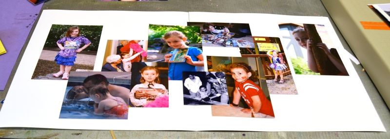
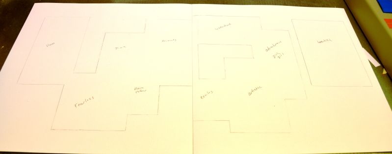
First I arranged the photos across the cardstock in a sort of haphazard way, but in a way that is pleasing to the eye, creates balance and keeps all the important parts visible while creating some white space.
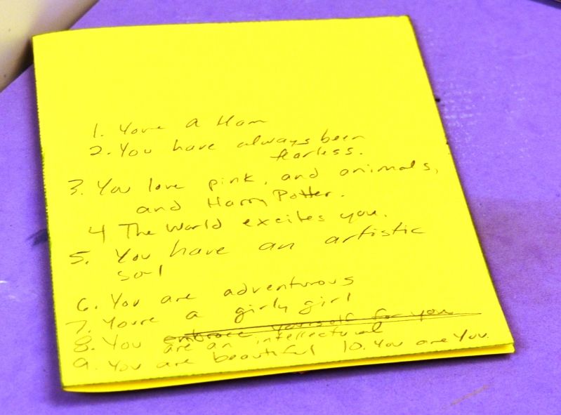
Next, I planned out what I was going to say. I wanted to make sure there would be enough room around the photos for the words to fit.
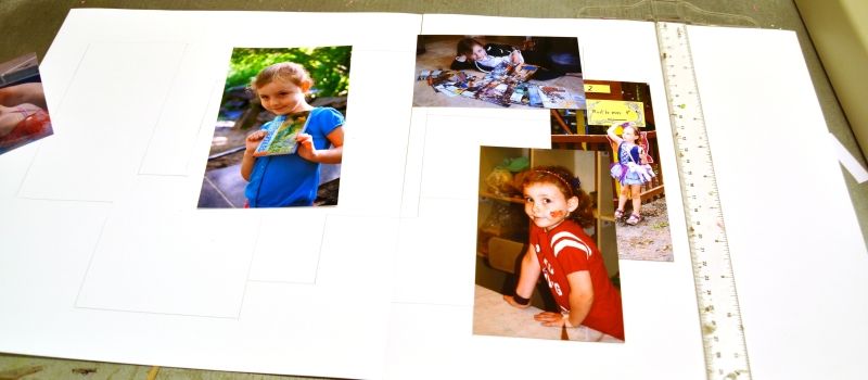
Then I traced the photos with pencil so I knew where they would be in the finished product. I use a T-square to make sure everything is straight. I also worked on one section at a time, so I only had to worry about the current couple of photos being straight.
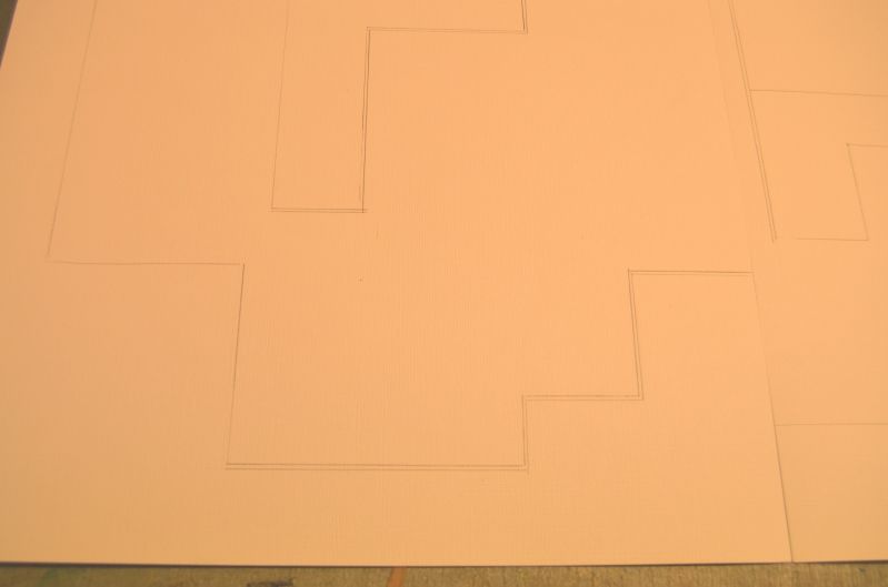
Since I didn't want to have to erase my pencil lines, or risk them showing later, I went back and made a second set of lines just a little bit set in from the originals. Then I erased the originals. This way the pencil lines will be sure to be covered by the photos.
Next I marked which photo was going to go where.
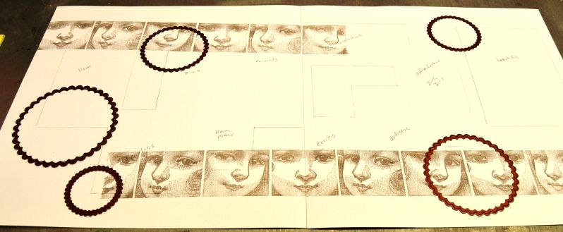
Then I got down to having fun! I used my Rollograph with the Doll faces stamp wheel and the ancient page ink cartridge in Flannel Grey. Then I used some Spellbinders nestabilities dies as a mask and positioned them where I wanted them so show up in the final product.Then I sprayed the whole page with some Smooch Spritz in Sea Kiss. Then for some accents, I added a few spritzes of the brand new Stephanie Barnard Dye ink Sprays.
After all of that was dry, I went back with some Stamps of Life stamps and Stephanie Barnard Dye ink in Cornflower and Party Pink, again using my pencil lines as a guide to position them.
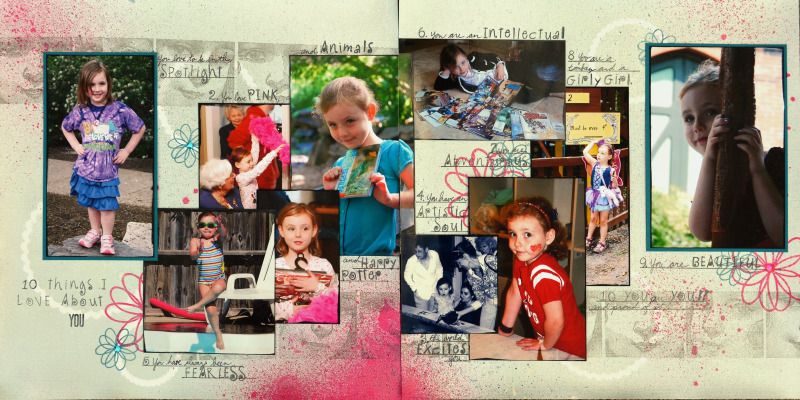
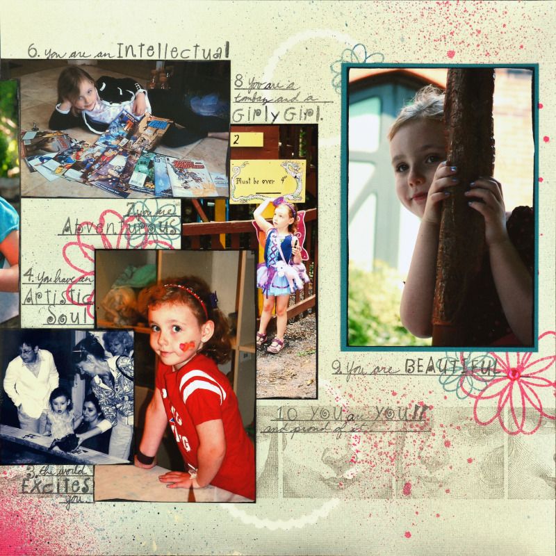
Next I added the photos back on before using some Hero Arts alpha stamps with Stephanie Barnard Dye ink in Kettle, a ruler and my own handwriting to add the title and journaling. I love how I got to use all of these photos that I adore, but didn't make it into their own pages. I also love how this handmade background is SO HER! The bright pink contrasting with the cornflower blue is perfect! It even matches the photos! And the mist is imperfect, but the flowers and masked rings have perfect placement due to the sketched lines.
Clearsnap Supplies: Rollograph Jumbo with self inking handle and Doll Faces stamp wheel
Stephanie Barnard Dye ink Sprays
Other Supplies: Spellbinders Nestabilities
Stamps of Life stamps

No comments:
Post a Comment